The Hidden Story Behind Game Shows and Their Futuristic Set Design

Table of Contents
It might not be something that you noticed before, but modern game shows share a very distinctive set design that makes them instantly recognizable when they’re on the TV.
Wide open spaces, metallic consoles, and superficial pulsing lights have become a tradition unto themselves, even when they’re not necessary. This wasn’t always the case, but there’s a science fiction story behind how they came to be.
Changing Set Design in Game Shows
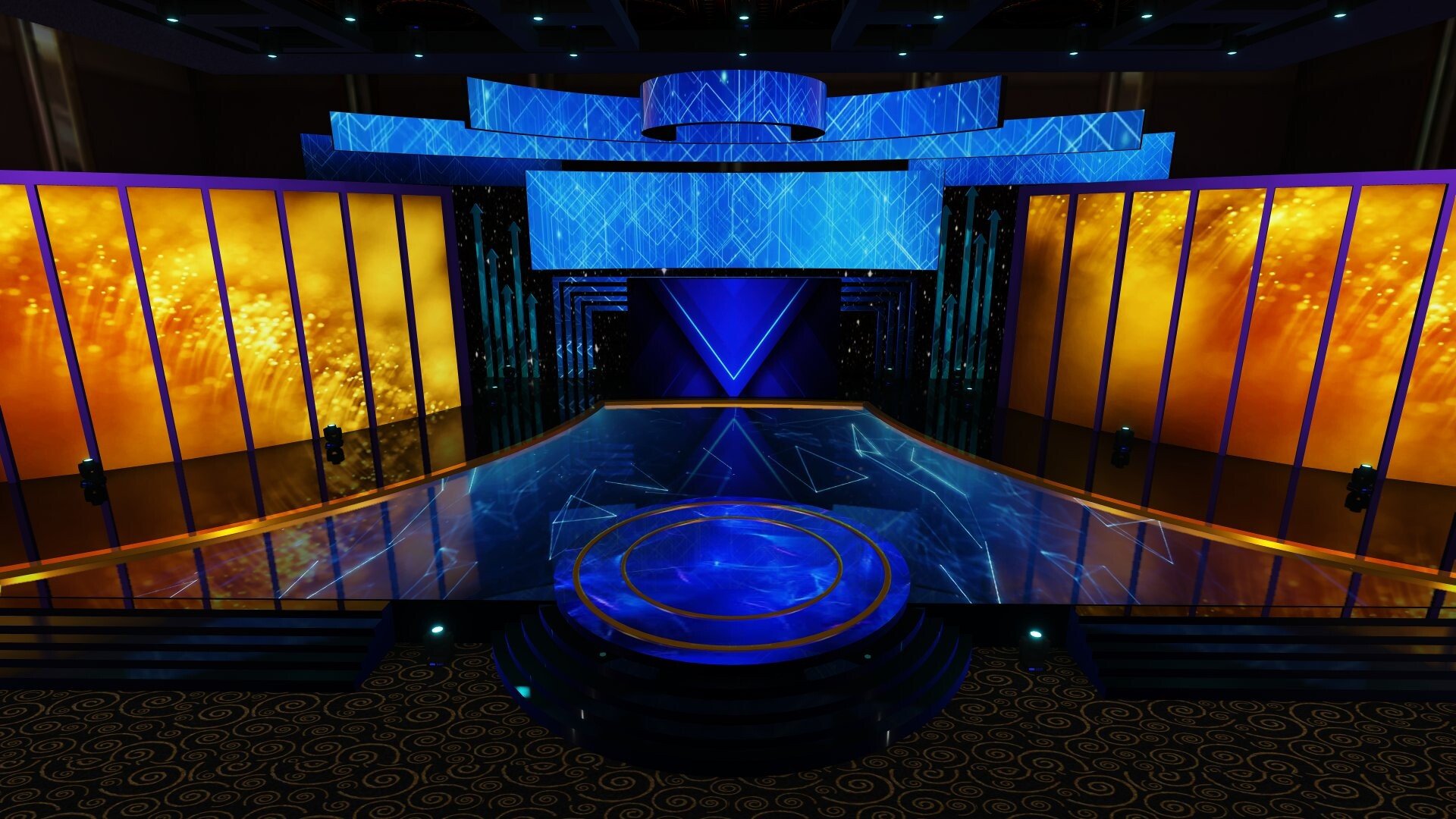 Like most set designs, the sets behind game shows have changed over the years. The first game shows, including The Price is Right, favored an elegant, curtained background over what they use today. Over time, that changed to become more open and colorful, with a lot of lights and effects happening in the background.
While classics are still going strong today on broadcast TV, new game shows have become popular on streaming services and other online platforms. Take online casinos, which have started exploring live, interactive game shows where the audience can participate.
That results in game shows like Paddy Power Mansion Heist, where the gameplay revolves around a colorful spinning wheel reminiscent of classic prize wheels in game shows. It also uses multiple side games packed into the same show, following the example set by the Price is Right way back in the ‘50s. In streaming, Netflix has also spearheaded many different game shows that follow the same set design.
Technology drives most changes in set design. Old game shows preferred a curtain because it looked better on greyscale television. Then, when color TV came along, production designers were incentivized to make the background more colorful and visually pleasing.
Now another tech shift is underway – the transition from old TV entertainment to new online entertainment. While online game shows follow the example set before them, they’ll also experiment with set design and create new trends that later game shows will follow.
Futuristic Sets & Game Shows
As mentioned, the first shift in game show set design came with color TV. That led to a pretty consistent ’60s to ’80s period of colorful, sometimes gaudy sets awash with bright blues, oranges, and yellows. It wasn’t just a landmark in visual media, according to Smithsonian Magazine, which outlined the historical importance of America cracking color TV first.
Then came the ‘90s, when the computer started to make its way into the home. They came in muted, neutral colors like white, black, or that very outdated beige color. The same colors were used for other consumer devices that used microelectronics, including silver.
Neutral colors and a minimalist aesthetic became popular in the tech industry and started to influence other areas of media. This is the same trend that would later result in Silicon Valley’s minimalist tech design in the 2000s and 2010s, best exemplified by Apple products.
![]()
Away from consumer tech, it also changed how set design worked. Sets welcomed more tech onto the floor, as contestants got their own podiums with screens and interactive controls, instead of just pressing a gaudy red button.
The lighting situation got more interesting too – static and moving spotlights were accompanied by pulsing light strips or LEDs built into the set itself. In short, game show sets started to look more like the set of a sci-fi show instead of a colorful parlor inspired by the fairground. This is something Den of Geek investigated in more detail, in the context of British TV shows.
That’s the story of how tech has driven game show design over the years. It influenced a lot more, of course, but the typically genre-free nature of game shows makes them a great example of the aesthetic and technological trends popular at the time.


